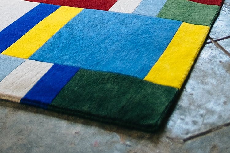
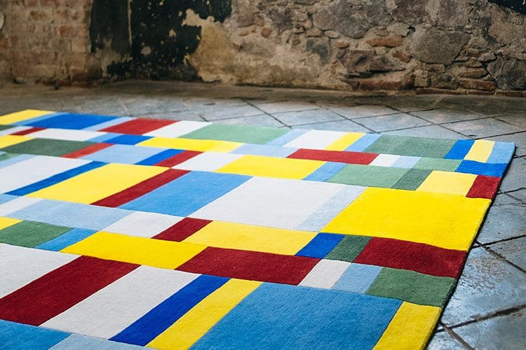
“Los colores del Español” is an abstraction of the colors in the flags of the countries where Spanish is spoken today. Today the Spanish language remains the most integral connection between Spain and Latin America; it is the one constant across a wealth of countries that have diverse cultures, religions and races.
Los colores del Español was made with tibetan hand knotted New Zealand wool
180 x 240 cm


Ahead of showing Weaving Design Stories at ZONA MACO 2019 (February 6 – 10, 2019) we spoke to each of the participating designers and studios to tell us more about their designs and the ideas behind them.
Jacobo Zanella is a creative director, photographer, editor of books and cultural magazines in Querétaro and Mexico City. He has developed several projects and exhibitions in Mexico.
Odabashian: Please can you tell us about your background?
Jacobo Zanella: I graduated in Architecture in 1996 but I soon found myself moving from one professional field to another. There are three things I enjoy a lot since I was a teenager: manually working with paper, taking photographs and designing books and magazines.
What type of projects do you typically work on?
It’s changed a lot over the years. I used to do advertising, then editorial design, branding, photography. In the last four or five years I mainly work on books. We have a publishing house called Gris Tormenta and that’s where most of my time and energy is focussed these days.
How would you describe the style of your work?
It starts very conceptually, and sometimes the concept is so strong it shows clearly in the final product. My design is ordered, sober, intensely iterated, with a no-nonsense approach at every step. I’m always thinking in the final user, so I use different processes depending on the design problem, but I’m always aiming for an invisible design, maybe that’s the constant throughout my work. I’m always very rational, I don’t know why, so I must force myself to let some emotions into the design sometimes —but never too much, always in a very subtle manner.
Please can you explain your approach to the Weaving Design Stories brief?
I thought the design brief was quite open, so my first intention was to reduce it to something more manageable. I was searching for a concept based on the cultural and ideological exchange between America and Europe over the last five centuries. To continue with the purpose of the exhibition, ‘develop a narrative about the flows of culture and soft power’. So, I explored the historical relationship between the American and the European continents, specially through language.
First I explored a map, a silhouette of the American and the European continents, with the Atlantic Ocean in the center, as a bonding space, but it was too obvious. Then I explored skin tones, how the mixture of colours formed over decades and centuries, from the whitest tone to the darkest. I kind of liked that one, but the overall tone of the rug was brown and not so exciting.
There are 20 countries today that speak Spanish in America, but it first came from Spain. 95% of Spanish spoken today is spoken in America, not in Europe. How Spain went from 100% to 5% today is a symbol of the power of the language in this region. A huge possibility of soft power, if you consider it globally.
What were some of the key decisions in creating your design?
The colors were the biggest part of my design. I took all the flags of every Spanish-speaking country, including the US, which is the second largest, and fused them into my rug; created an abstract mosaic. The colors speak for themselves. When you think of a German yellow, say, you notice is quite different from the Colombian yellow. Or the color palette of African flags is very different from the mosaic of the American flags. So in the end I think I found an identity of Spanish reduced to its simplest, reduced to a few colors. You may read it as the DNA chart of a culturally interlinked region. There are ten final colors that, mixed, speak of the infinite nuances and richness of a language that has no comparison with any other language of the world in extension and idiosyncrasy.
What was the most surprising thing about working in this medium?
I never thought I would be asked to design a rug. I was doubtful at first… How to design a rug? But I soon found out that rugs require a high level of abstraction, a process which I’m very familiar with. I enjoyed it very much, I think it’s a great exercise.
What aspects of the final rug are you happiest with?
The quality of the materials and the colors. They’re stunning.