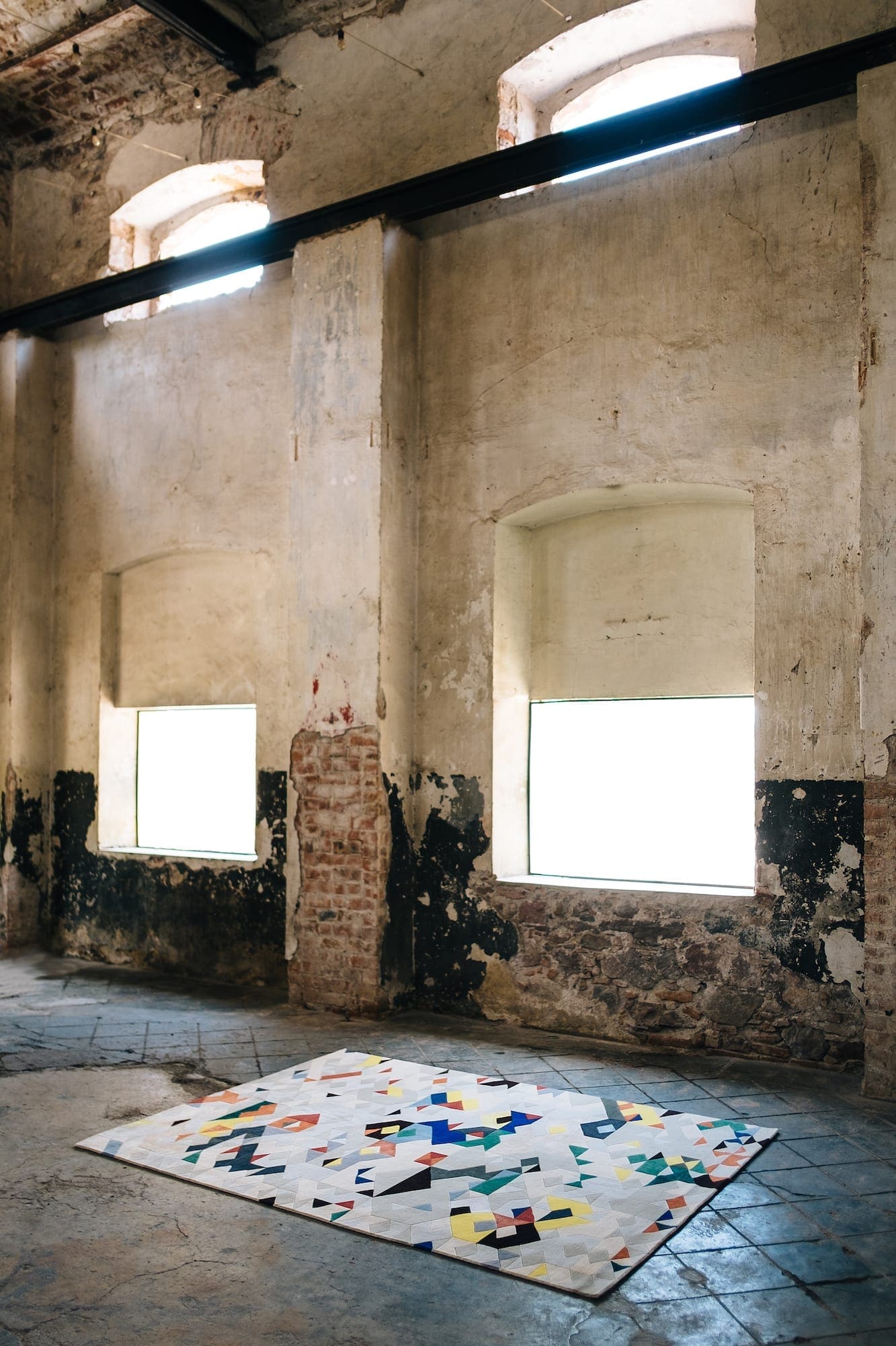
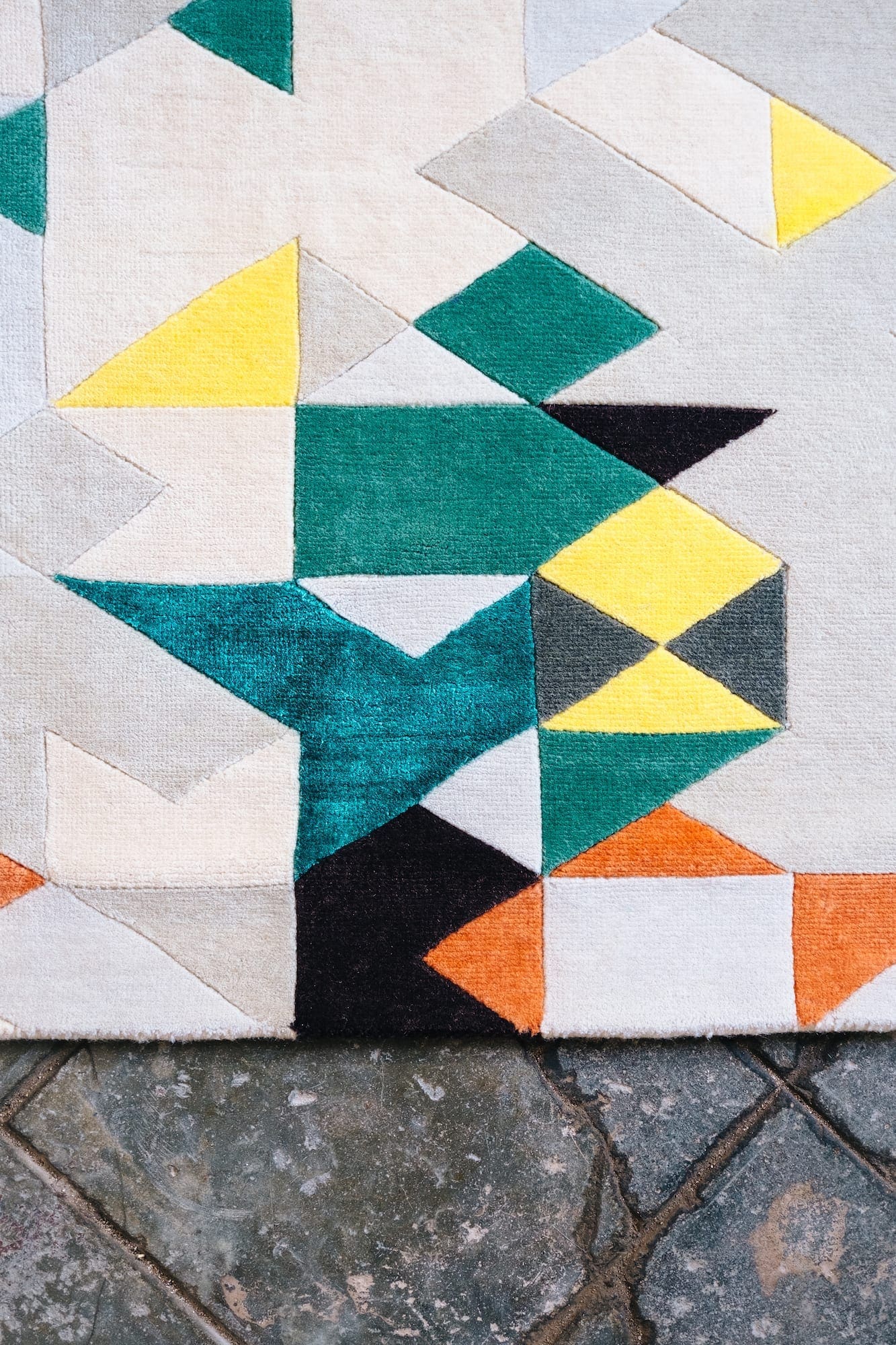
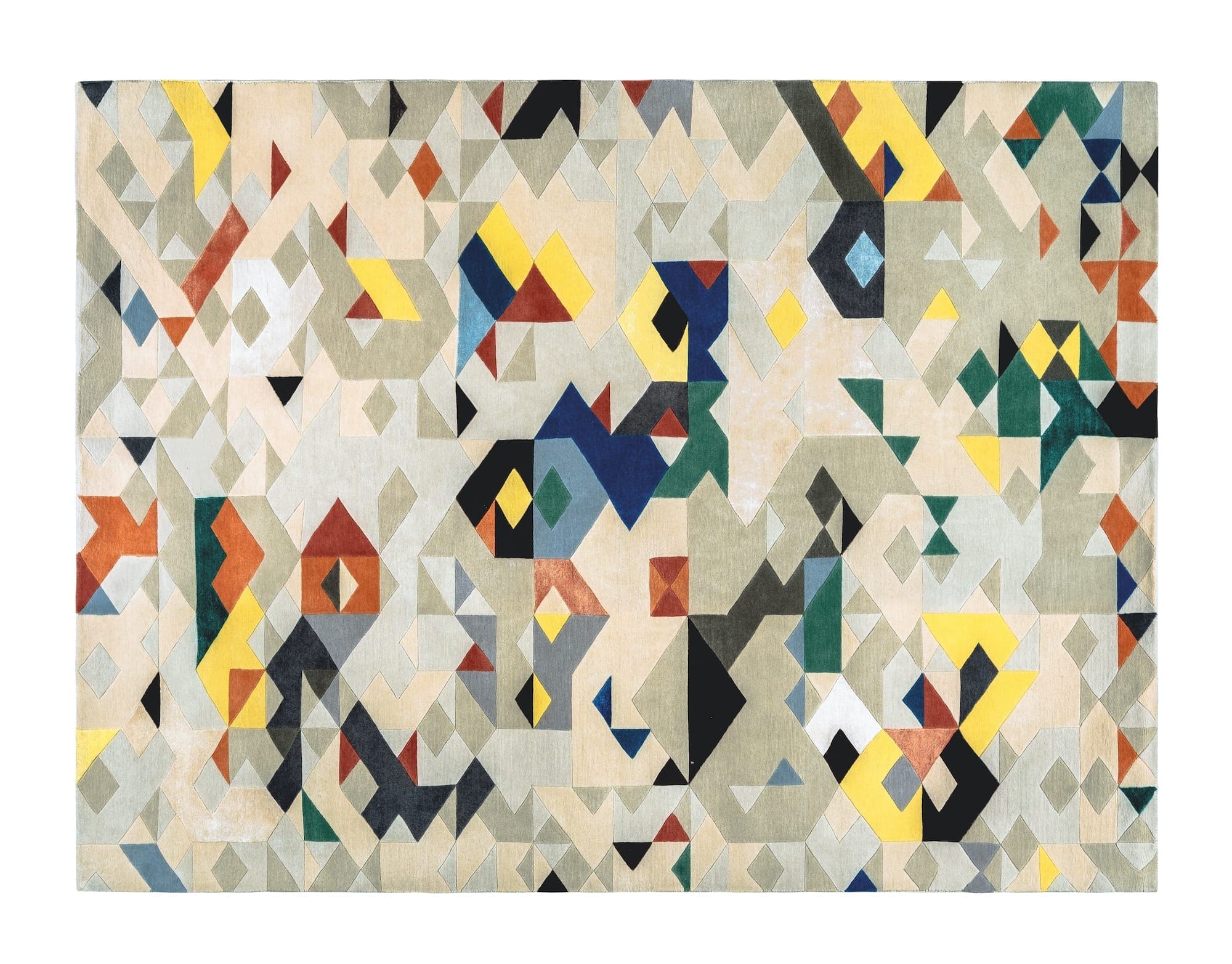
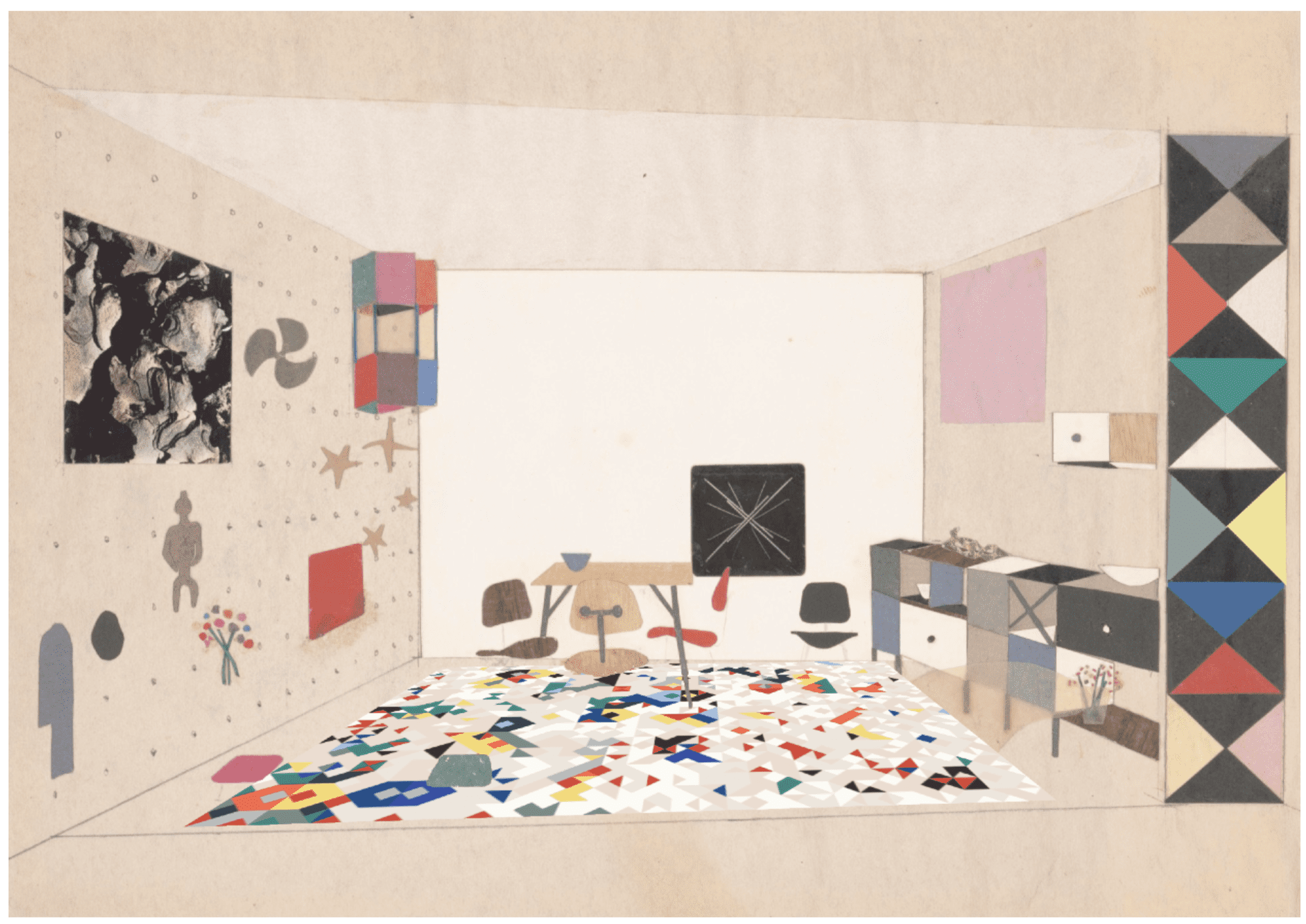
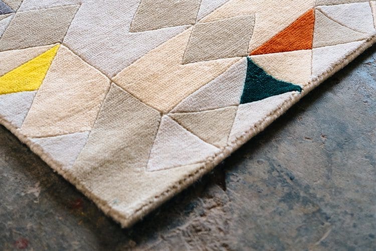
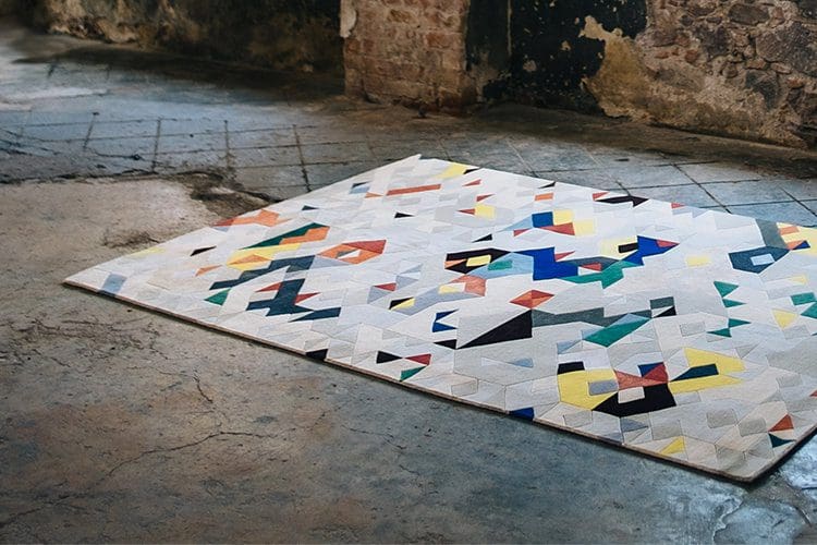
“Tilos Glitch” was inspired by an old rug that has an origami pattern resembling a bird. We updated the design making the bird suffer what is known as “generation loss”, loss of quality between copies that generates faults replaced by the computer. Once passed through this filter we renewed the color palette.
Tilos Glitch was made with tibetan hand knotted New Zealand wool
240 x 180cm
Ahead of showing Weaving Design Stories at ZONA MACO 2019 (February 6 – 10, 2019) we spoke to each of the participating designers and studios to tell us more about their designs and the ideas behind them.
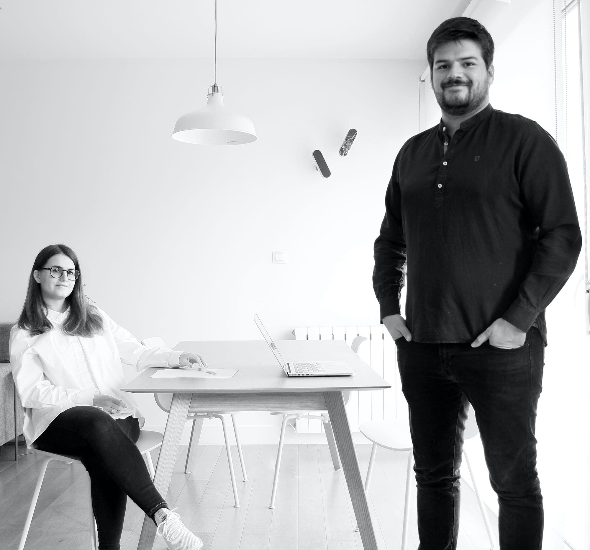
31/20 (Pablo Lujambio and Cristina Pou) is a Bilbao-based studio, whose trajectory has seen them undertake architecture and design at different scales, from industrial projects to product design.
Odabashian: Can you tell us about the origins of 31/20?
Pablo Lujambio: I both studied architecture, we met during college. I was always very attracted to all of the fields of design. I wrote HTML code when I was twelve and was really intrigued about how to transform code into design. I was also always interested in architecture, how buildings where made, why design decisions where taken, materials, colors, textures… how these elements shaped spaces and created atmospheres. I chose to pursue architecture because I considered it to be the most comprehensive design field.
Cristina comes from a family of architects so design conversation has always been very present in her family.
We are a couple so we had been discussing starting our own studio for some years and we finally decided to do it around three years ago when we formed 31/20.
What type of projects do you typically work on?
We more and more focused on interior design lately but we don’t really have a ‘typical’ project. We’ve worked on everything, from industrial architecture (a 10,000m2 production plant for example) to smaller objects like the Apollo we did for Casa Gutiérrez Nájera two years ago.
How would you describe the style of your work?
I would say referential. We love architecture and design history, almost to the point of obsession. We try not to abuse it, but we definitely work with references to what we find to be icons in design and work from there. Maybe this is because we are starting in this field (5 years in this or any area is just the beginning) and we feel more comfortable standing on someone else’s shoulders than ‘going rogue’ just yet.
Please can you explain your approach to the Weaving Design Stories brief?
The project came to us with somewhat the perfect timing. We found an old rug designed by Cristina’s grandfather and wanted to re-imagine it. We where thinking about this for a while and suddenly we got the invitation to be part of Weaving Design -stories so it was the perfect opportunity. I believe it drove us way further than our original ambition would had taken us. We explored the idea of the glitch which is a phenomenon that happens on the digital world, when a pixel is missing and the computer uses the rest of the pixels to find a solution to that issue. One of the forms for this phenomenon to take place is through Generation Loss, which is a process that makes a glitch take place when you send a picture over and over and over. We found this was a good idea to apply to the rug since it was an object that was passing from generation to generation in the family.
What is the main connection of your design to The Silk Road?
The original design of the rug was a pattern based on an origami figure representing a bird. We learned during the design process that origami traveled from Asia to Europe via The Silk Road, entering through Spain. Also we thought about the parallels between the internet (which is the environment where a generation loss takes place with images) and The Silk Road as the information highway back then.
What were some of the key decisions in creating your design?
Bringing the color palette of the 1960s to 2018. We thought of a set of maybe 4 basic colors and then we worked around different shades of every one of them. We started thinking of them as different lengths of the weave of the rug, to create different shades but it ended up being different tones of the same length. The use of silk, which was suggested by Odabashian was definitely a key decision, it really enhances the design.
What was the most surprising thing about working in this medium?
It was a learning process, the team at Odabashian shared a lot of knowledge both prior to the design and afterwards, which has been enriching for us. Now we have a much more solid base to work from should we work on something like this in the future. To learn about the difference between a Tibetan knot or an Iranian knot for example, is something that can shape your design completely, these are things we didn’t know anything about prior to this wonderful collaboration.
What aspects of the final rug are you happiest with?
The texture, which feels fantastic. We love how the rug reacts to light – in some situations the silk and the wool look completely different and in others the look the same – it makes the piece more interactive since you get to see it differently every time you look at it.